It’s reboot time! It’s been eighteen months since I last posted here, and four years since I started my PhD. But my thesis now is nearly out of the way, which means I can return to more recreational forms of writing. It also means I can unveil what I have been working on to keep myself sane during the final stages of my PhD. In case I never fully explained, my PhD was about the application of a computational text analysis technique called topic modelling within social science. Basically, I spent the last four years learning how to do useful things with large amounts of textual data — a practice known as text mining or text analytics. Along the way, I also spent time experimenting with ways of putting textual data on a map. You can see some of the early results in my other blog, which for the last couple of years has been just as neglected as this one.
The methods I explored in my thesis were all based on a dataset of news articles and other texts about coal seam gas development, which has been a touchy topic in recent years in Australia. But I never forgot about my local history blog, and I always hoped to return to it armed with a new bag of tricks. And now here I am, with bag in hand.
Cultural cartography
If you’ve spent any time exploring this site, you’ll know that I’m fond of projecting old maps and plans onto the modern landscape as a way of seeing how things have changed. I’ve done this by photoshopping the maps to extract the details and then loading the results into Google Earth, where they can be explored immersively and in three dimensions.
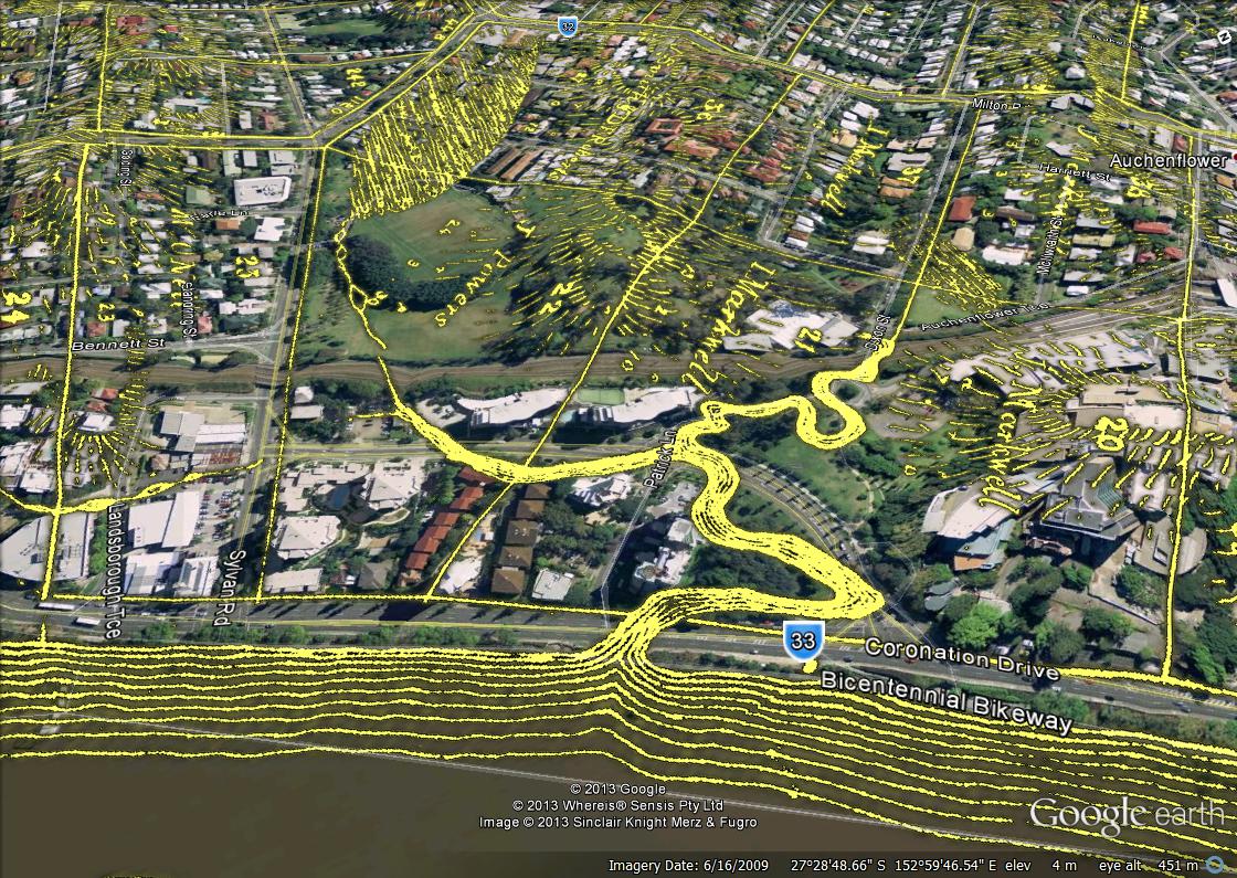
Figure 1. Langsville Creek as depicted in 1859, overlaid on the present-day landscape.
My main motivation for developing this technique was to explore the physical features depicted on the old maps, but sometimes the textual features prove to be just as interesting. In the example above, you can see the names of the people who owned the land in 1859. Even if you don’t know who the people are, it can be eye-opening to discover how much of the city was once in the hands so few. More exciting to me, however, is maps that include surveyors’ annotations describing things like the character of the vegetation and the soil, and the prospective uses of the land. The example below is from an early plan of the Toowong area. I’ve also explored these kinds of annotations on early plans of Milton and Norman Creek.
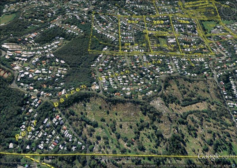
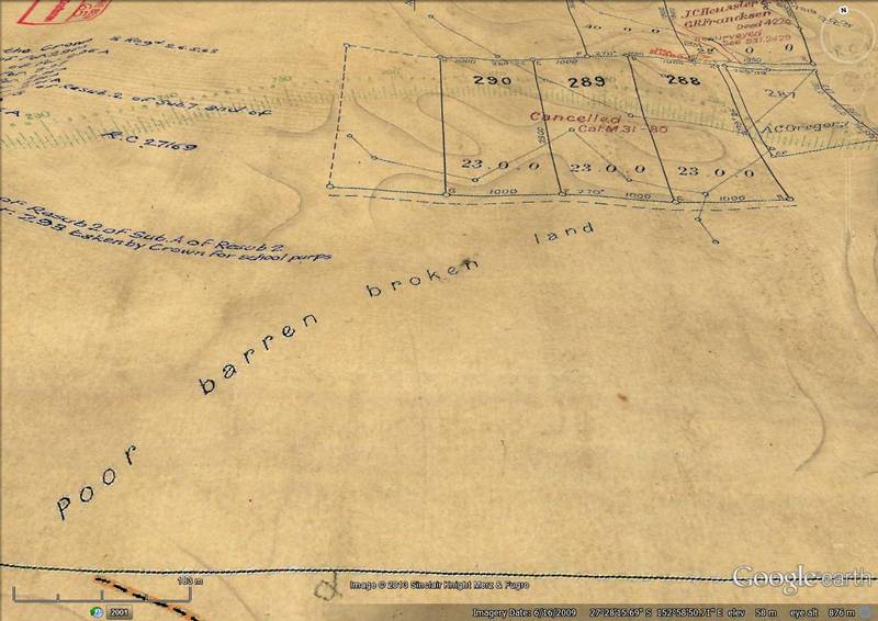
Figure 2. The empty area in the middle of Plan M.31.65. This area corresponds with the slopes on either side of Birdwood Terrace near the Toowong Cemetery.
I find these annotations interesting because they reveal something about what the landscape meant to the people who mapped it. They are a reminder that the landscape has a cultural history as well as a physical one. Even so, maps like these convey only a thin sliver of that cultural history, the fuller details of which might be found in other historical records such as writings, paintings, and photographs, if not also in the memories, customs, and language of current inhabitants. Maps are not the natural home for this kind of information, since you can only add so many words and pictures to a map before it becomes unusable. At the same time, however, maps are the most natural way to index geographically relevant information. There is an obvious motivation, then, to look for ways to squeeze text and other kinds of qualitative information into a geographic framework.
The simplest way to achieve this is to use a map as an index to other content. We’re all familiar with this approach: we engage with it every time we use Google Maps to look for a nearby cafe or convenience store. You might have also come across maps in which place-markers link to cultural or historical information, perhaps through a pop-up balloon. The Cultural Atlas of Australia, for example, maps locations that have featured in iconic Australian films, novels and plays. Or if you’re more of a Charles Dickens fan, you can explore every location in London that was mentioned in his novels.
More than mere portals
These kinds of geographic indexes are useful, but not much fun. They reduce a map to being a mere portal rather than a product with value in and of itself. They ignore the potential for a map to evoke and excite rather than to merely inform.
The driving question behind the undertaking I’m about to describe is this: Is it not possible to produce a cultural map that does not need to be clicked on to do its job? One that invites exploration and suggests meaning rather than one that merely enables queries? One that through the mere positioning of carefully curated elements can convey something about the deep cultural history of a place?
Maps fitting this description are not very easy to find. Most that I have seen are made primarily for comedic purposes. The map below, for example, comes from the Atlas of Prejudice, a “guide to human bigotry” that cleverly combines cartography and cultural stereotyping. What makes these maps work is their ability to distil down to a single word or phrase what each place supposedly means to a particular group of people. What these maps lack, however, is any direct line to empirical data. The stereotypes may be real, but their curation is (as far as I know) entirely subjective.
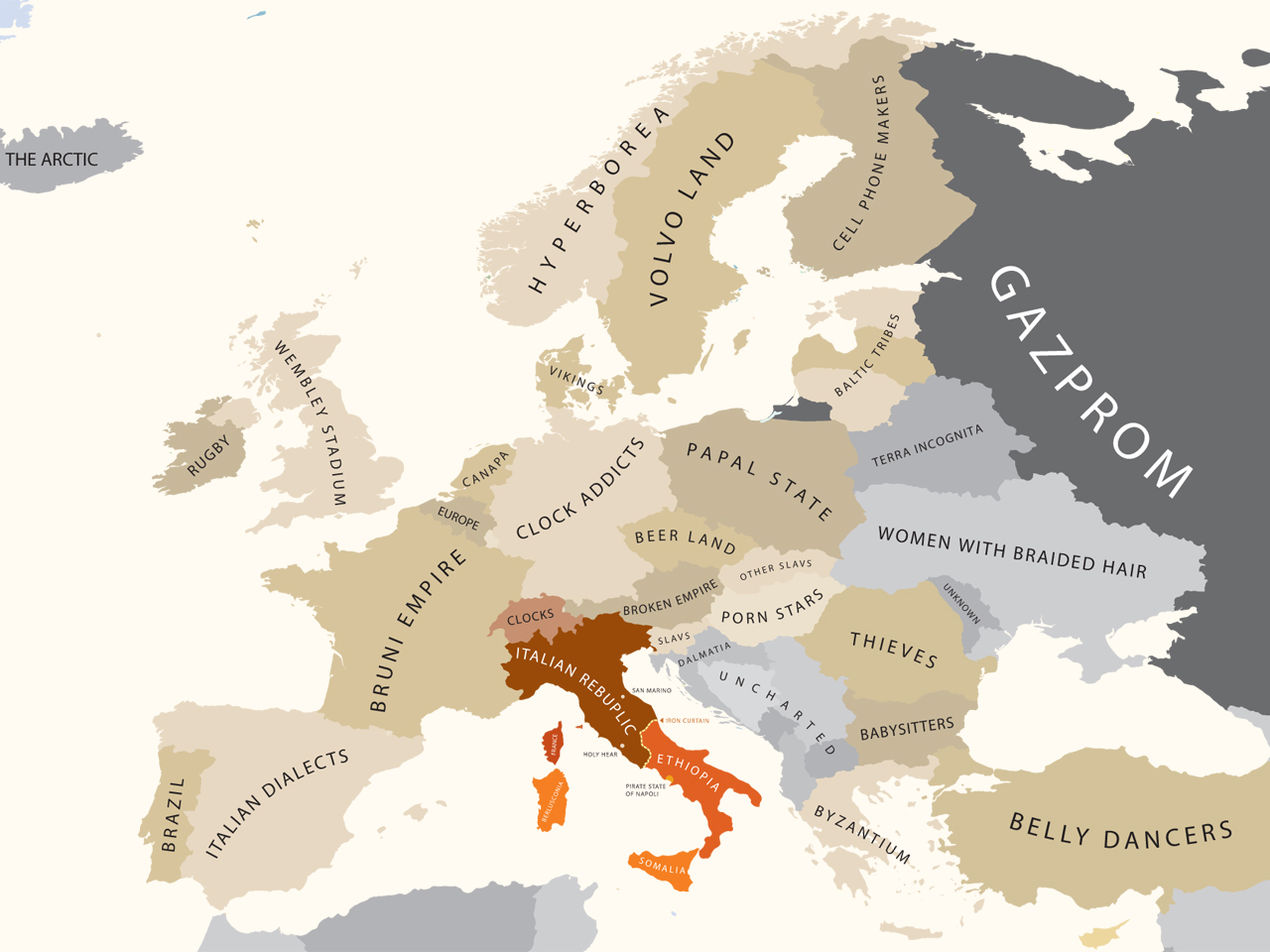
Figure 3. Europe according to Germany, as per the Atlas of Prejudice (this example comes from the Flickr page of Yanko Tsvetkov, who created the atlas).
A more empirically grounded approach to mapping cultural associations can be found in etymological maps, which show the original meaning of contemporary place names. On the Literal World Map, for instance, Spain is the Land of Many Rabbits, while Italy is the Land of Young Cattle. Brazil is Red Like an Ember, while Mexico is the Navel of the Moon.

Figure 4. An etymological map of country names, produced (oddly enough) by a company called Credit Card Compare.
A Google search turns up similar maps showing the etymologies of places in North America and Mexico. (Alas, I have not yet found one for the Southern Land.) More than just novelties, these maps convey something that is real and meaningful. In just a few words, the translated names capture something about each country that was significant to the people who named it. They unlock a layer of historical information that was hidden in plain sight.
These etymological maps may have the historical veracity that the Atlas of Prejudice lacks, but they represent only a narrow slice of the historical record. Names may be significant, but they do not embody all that is significant about a place, especially to people other than those who did the naming.
Might it be possible, then, to create a cultural map that draws on draws on a cultural or historical context of our choosing, but that does so in an empirically grounded way?
The rest of this post will describe my attempt to do exactly this. The method works by using computer-driven techniques to extract place names and related words from a relevant collection of texts. I’ll first describe the method in broad terms (I’ll leave the details for another day), and then dive into the results that it yields when applied to a collection of newspaper articles published between 1885 and 1890.
Textual treasures
In all but the most abstract of writings, you are likely to find references to places. After all, places are where things happen. So almost any collection of texts, or even a singular work such as a novel, is a potential source of verbal associations that could be placed on a map. Each source of text will provide a different window to the cultural and historical meaning of a place. Some sources, however, are more bountiful and more accessible than others. For my purposes, there is one very obvious source to use, and that is digitised collection of newspapers that is available through Trove, a national online treasure maintained by the National Library of Australia.
I can’t overstate the importance of Trove to the website you are presently reading. Had I not stumbled across Trove when I started googling Red Jacket Swamp several years ago, the idea of creating oncewasacreek.org simply would never have crossed my mind. Much of the story that I have pieced together about the early history of Western Creek and its surrounds has come from the newspapers in Trove, particularly the Moreton Bay Courier (1846-1861), the Courier (1861-1864) the Brisbane Courier (1864-1933) the Courier-Mail (1933-1954). Especially in the early days, when Brisbane was small and its daily paper included everything from the administrivia of local council meetings to the latest shipping arrivals, social gossip and soccer results, these newspapers provided a surprisingly detailed account of what went on across Brisbane’s suburbs and surrounds. And they didn’t completely ignore the rest of the colony either.
Trove is set up so you can browse these newspapers, search them by keyword, and read them in their original form. But what makes Trove especially useful for researchers like me is that it has an application programming interface, or API, through which content can be retrieved in bulk. It’s not quite as simple as hitting a ‘download all’ button, but with a little bit of effort, you can download articles from Trove in their thousands.
So, thanks to the newspapers on Trove, there is no shortage of text from which to create some kind of cultural-historical map of Brisbane and beyond. But there’s a big gap between newspaper texts and a map of interesting words. You may well be wondering how I plan to bridge the divide.
Discursive aromas
The crux of the method is this. Within a given collection of texts, each place that is mentioned will appear alongside certain words more frequently than others. In general, the words that appear most often with a given place name will reflect the themes or events that are most commonly discussed in connection with that place. You could say that these words constitute the textual ‘aroma’ or discursive context of that place, at least within the collection of texts being considered. This discursive context, or at least a carefully curated slice of it, is what I propose to put on a map. If this curation is successful, the resulting words, once appropriately positioned, will produce a coherent and evocative representation of the landscape’s history.
This method rests on two crucial steps. The first is to identify and tally the places mentioned in the newspaper articles, and the second is to determine which words best distinguish each location.
The first of these steps is called geoparsing, and it’s hard to do even at the best of times. It’s especially difficult to do when the text you’re working with is less than pristine, which is a very generous way to describe much of the text in Trove. Because the newspapers were scanned from microfilm rather than from the original papers, the resulting images are not always clear, and the digitised text is full of errors, sometimes to the point of being unreadable.
I experimented with some pretty wacky methods to refine and geoparse the articles that I worked with (I plan to discuss these on my other blog when I find the time), and the outputs were still littered with errors, some of which you’ll see shortly. But the results were right more often than they were wrong, and for the outcome that I am trying to achieve, that’s good enough. You might have heard a musician say that a wrong note is “close enough for jazz”. Well, as far as I’m concerned, text analytics is the jazz division of data science. And to be clear, I love jazz.
The second step, in which the locations are paired with relevant words, requires the use of carefully calibrated statistics that measure the occurrence and co-occurrence of place names and other terms. I won’t go into these in any detail here, except to stress that there is no one right way of doing this. There are various ways of measuring associations and weighting term frequencies (my approach combines measures called pointwise mutual information and TF-IDF), and each will yield different results. Using these techniques effectively is an art as much as a science, especially when the goal is exploration and evocation rather than deductive analysis. Following the olfactory metaphor that I employed earlier, you could call this approach textual aromatics — a softer, more impressionistic cousin of hardline text analytics.
Once the locations and their defining words have been identified, the question that remains is how to put these results onto a map. As you’ll see below, I have again employed Google Earth for this purpose, as I love the rich visuals and immersive interactivity that it affords. Google Earth also offers popup balloons through which additional detail and linked resources can be provided. In the screenshots that I’ll present shortly, you’ll see the top two words for each location. Clicking on these words in Google Earth (which you can do by downloading the KMZ file) will show you the top 10 words, as well as provide hyperlinks to the most relevant articles on Trove.
I don’t know if this kind of map that this method produces has a name, so until I think of a better one, I’ll call it a geo-textual or (if I’m feeling fancy) a geo-discursive map. There are a few comparable efforts out there on the web and in academic literature, but I plan to discuss those, along with the more technical details of what I’ve done, on my other blog in the near future.
Australia according to the Brisbane Courier, 1885-1890
To develop and test this method, I applied it to a collection of 42,322 articles published in the Brisbane Courier between 1885 and 1890. These articles comprise all of the content published in this period except for the 11,243 items which Trove has classified as advertisements or lists. (I hope to include these items in later iterations, but at this stage they created too many difficulties to warrant inclusion.)
There’s no particular reason why I chose the period of 1885 to 1890: really I just followed my heart. It would be possible to run this analysis on the entirety of the Brisbane Courier — or for that matter, on the entirety of Trove — but not without a supercomputer or a lot of spare time. Processing this sample of 42,322 articles on a fairly powerful laptop took hours rather than minutes, so there are limits to how far I could scale up this analysis without additional infrastructure. I could analyse a broader time period than I have here, but only by sampling the data more sparsely.
Did the method work? Mostly, yes. And in some instances rather spectacularly. You can explore the results yourself by downloading the KMZ file at the end of this post. Here, I’ll provide a guided tour of these results — a words-eye view, if you like, of selected parts of the country. I’ll start big, and then gradually zero in on home soil.
Eastern Australia
The screenshot below shows the results that the method produced for a large swathe of eastern Australia. In this image, the results for individual locations have been aggregated into broad regions (specifically, the SA4 regional boundaries used by the Australian Bureau of Statistics). The markers represent the average location (the centroid) of all of the places mentioned within each region, and the labels show the words that, on average, had the strongest associations across those locations.
For example, the words most strongly associated with locations in the central northern region of New South Wales (named Far West and Orana by the ABS) are pastoral news and fat bullocks. Other related terms (not shown on the map, but accessible on Google Earth if you click on the marker) include rabbits, lambing and stock routes. Pretty clearly, then, this region was discussed in the Brisbane Courier primarily in connection with its pastoral industry. That, and the fact that it was being overrun by rabbits.
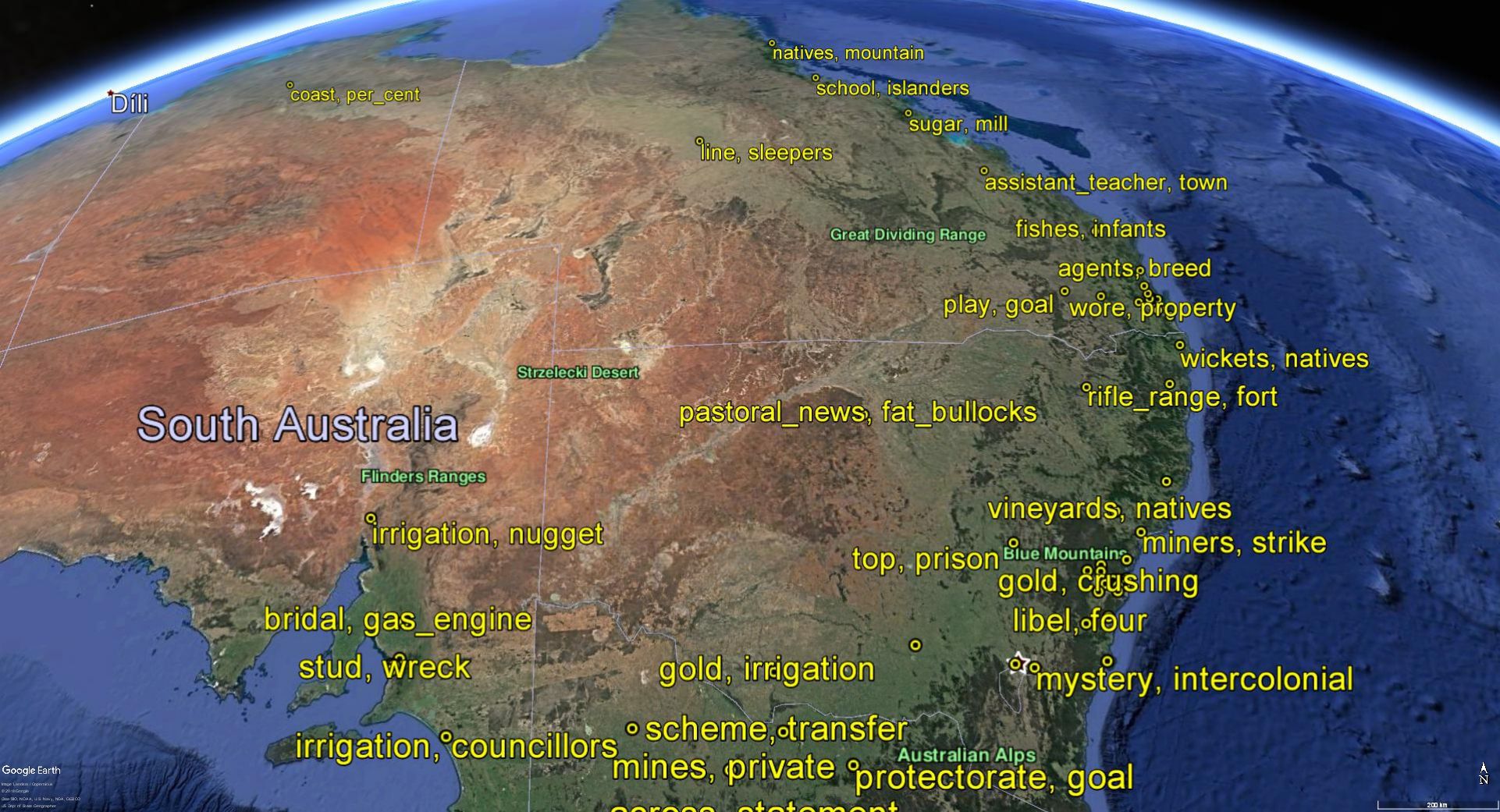
Figure 5. The words most closely associated with locations mentioned in the Brisbane Courier between 1885 and 1890, aggregated by SA4 regions.
(In the previous paragraph and in the remainder of this post, the italicised hyperlinks will take you directly to articles on Trove that feature the linked word and the relevant location. These articles have been identified automatically based on term counts, and are also accessible via the pop-up balloons in Google Earth.)
In the Murray region and other southern parts of the mainland, we can see the importance of gold mining and irrigation, the latter of which was only established on the Murray River in 1887. In Newcastle, coal miners went on strike in 1888, while in the nearby Hunter Valley there were concerns about the possible impact that the phylloxera insect could have on local vineyards. Meanwhile, the sugar industry was thriving in the Mackay region of northern Queensland, and engineers were having debates about what kind of sleepers would best service the expanding railway line through the outback.
To be sure, not all of the terms that appear on this map are meaningful, or even correct. For instance, there may or may not have been a rifle range in the New England region, but the reason why the term appears there on this map is because there is a place here that shares its name with Victoria Park in Brisbane, where there definitely was a rifle range. And the fort in the same label refers to the ‘South Channel’ of the Port of Melbourne, and not to the place of the same name in the New England region. Meanwhile, the fishes in the the Wide Bay region appear to derive from a single long article (which would have counted for several articles due to the statistical methods I used) about an ancient lungfish of the genus Ceratodus. The fish may well have occurred in the Wide Bay region, which is presumably why there is a place here that bears the same name. The article, however, talks about the name of the fish, not the name of the place.
In other words, there are more errors in these outputs than I would like. But I’m confident that the number of these will reduce as I tweak and improve my geoparsing method, which, as I mentioned earlier, is still rather experimental.
Northern Queensland
With that caveat in mind, let’s see what kind of words appear as we get a bit closer to the ground. Figure 6 takes us to northern Queensland, with the view extending from Gladstone in the south to Port Douglas in the north, with Townsville and Mackay along the central stretch of the coast (yes, I know, the obscuring of place names is far from ideal!). The previous screenshot (Figure 5) showed that this region was sugar country (as indeed it still is). The map below, which aggregates the raw results to smaller regions, reinforces this association, adding the word plantations to sugar and mill.
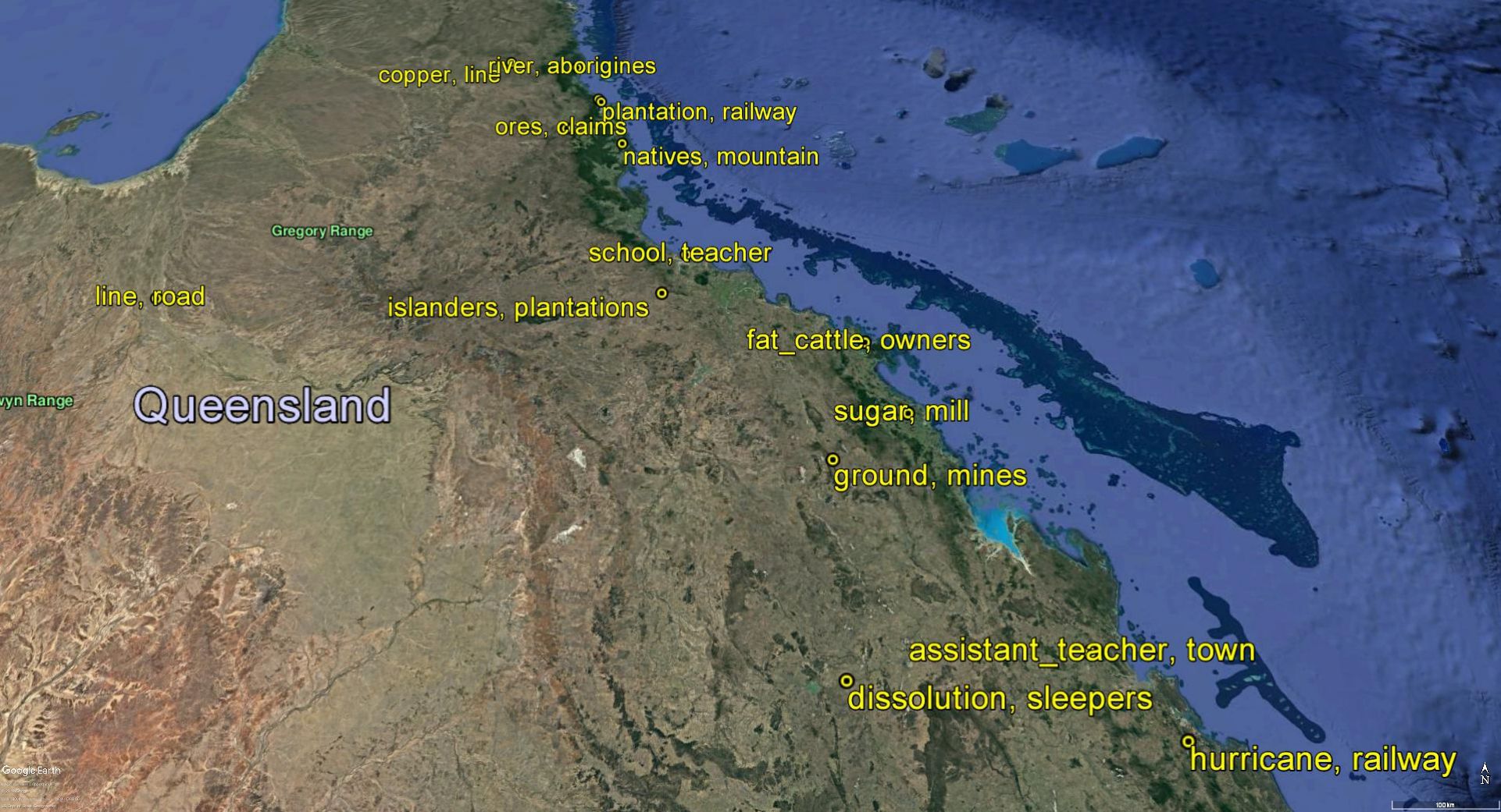
Figure 6. The words most closely paired with locations in northern Queensland (the coast in this image extends from Gladstone to Port Douglas). The results have been aggregated to the SA3 boundaries defined by the ABS.
A more curious addition is the word islanders. It turns out that this word refers to the Pacific Islanders who were used as slaves in Queensland’s sugar plantations between 1863 and 1904. The top article that links to this word-location pairing describes the compensation claim of “James Mackenzie, sugar-planter and manufacturer at Seaforth, on the Lower Burdekin, for £4972 6s., in respect of fifty Pacific Islanders, of whose services he had been deprived … when they were removed by the Polynesian inspector for the purpose of being returned to their native islands.” Also common in news about this region were references to the natives, the blacks, and the aboriginals.
Figure 7 zooms in even closer on the Townsville region, and uses a still finer level of spatial aggregation. Here we see words that relate to activities beyond growing sugar and dealing with natives. The mineral wealth of the region is evident through references to the mining and smelting of ores including gold, silver, copper and, tin. (Irvinebank, just south-west of Cairns, was at the centre of a tin mining boom in the 1880s.) The fat cattle at Mount Marlow at the bottom of the frame suggest the presence of a pastoral industry as well. At the top of the frame is Port Douglas, through which passed goods such as kegs of butter from Sydney and bales of sheepskins bound for London.
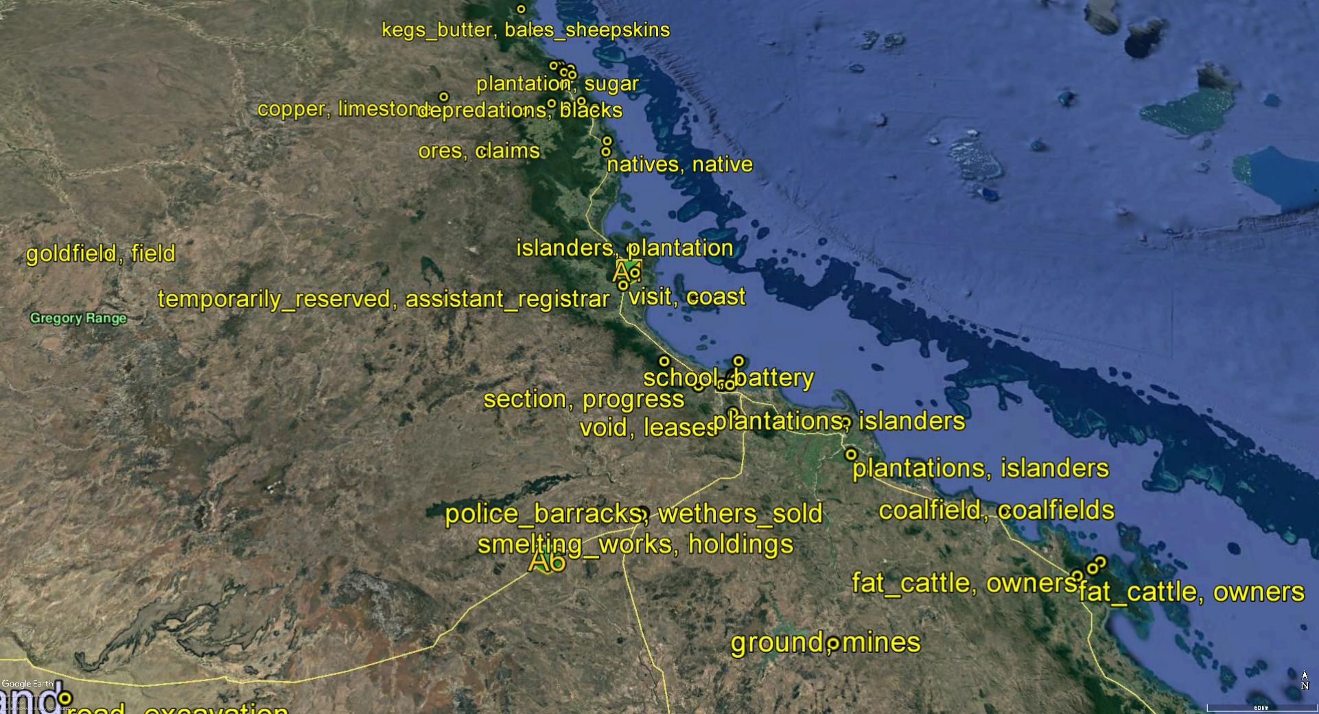
Figure 7. Textual associations in the Townsville region of northern Queensland. These results are aggregated to the SA2 boundaries defined by the ABS.
South-east Queensland
Figure 8 takes us to the area surrounding Brisbane in south-eastern Queensland. Here again, many of the words have an agricultural flavour: there is the cultivation of lucerne in the Darling Downs, of cane around Coomera, of vegetables in Runcorn, and of bullocks in Beaudesert. Unfortunately, The words lime and child at Toowoomba are errors, having come from the report of a court case in which the defendant allegedly used lime to injure a child by the name of Redwood, which is also the name of a place just near Toowoomba.
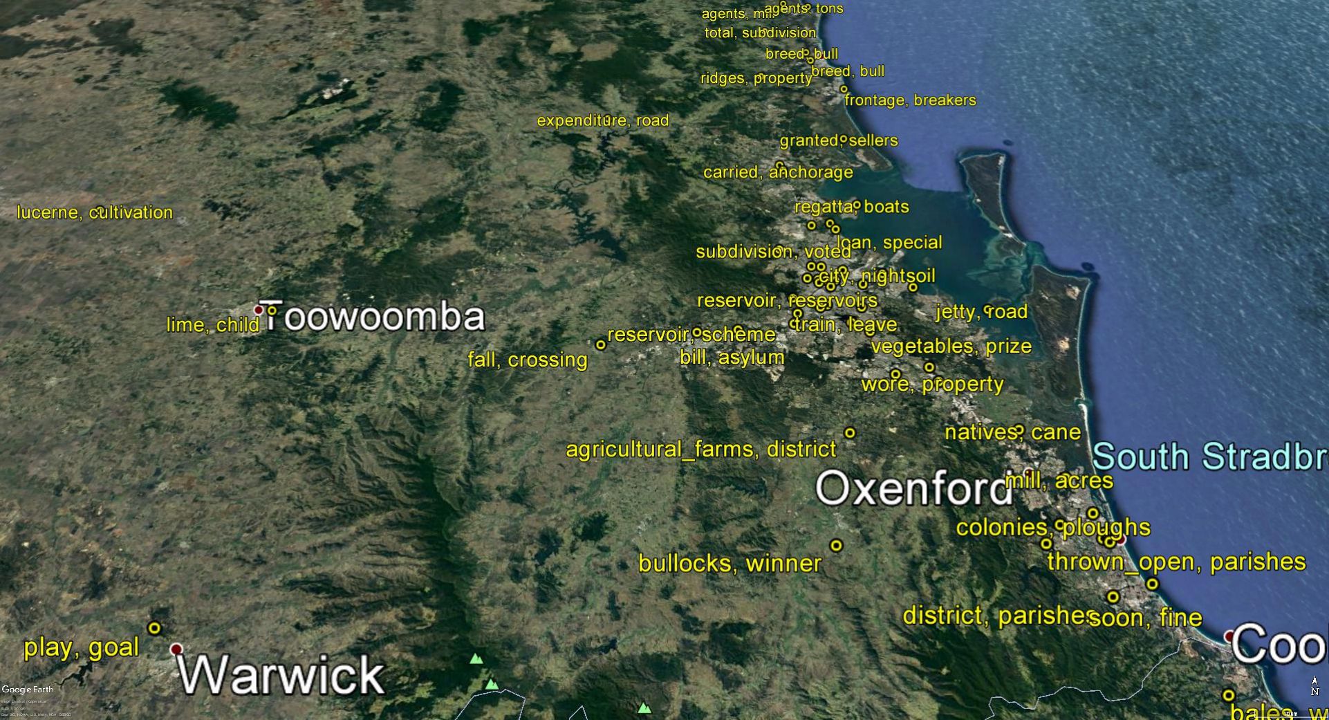
Figure 8. Textual associations (aggregated to SA3 regions) of locations in south-eastern Queensland.
Greater Brisbane
The next image takes us into the greater Brisbane area, the frame spanning east-west from Cleveland to Ipswich, and north-south from Redcliffe to Beenleigh. The terms reservoir and scheme at the western extremity relate to Mount Crosby, which the hydraulic engineer W. Davidson singled out in 1889 as being an ideal location from which to take water from the Brisbane River to supply the growing city. (Up until this point, Brisbane’s water supply had come from reservoirs at Enoggera and Gold Creek.) Also in this district was the New Chum coal mine, where (like in Newcastle down south) in 1886 workers were beginning to unionise. Although it doesn’t appear at this level of detail, the word asylum also features in this area on account of the “asylums for the insane” (one for males and one for females) located in Goodna and Ipswich.
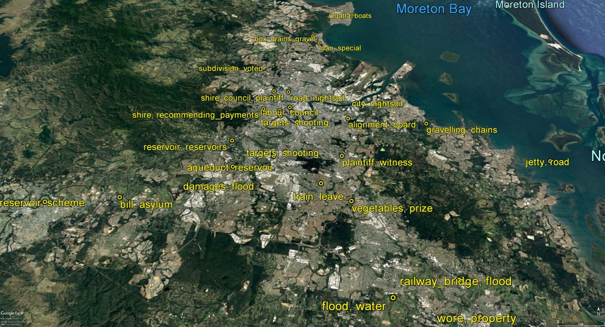
Figure 9. Textual associations in the greater Brisbane area, aggregated to the SA3 boundaries.
In the bottom-right corner of the image, we can see references to the disastrous flooding of the Logan River in January 1887, which, among other things, swept away the railway bridge. The Brisbane River also flooded at this time, but, interestingly, flooding appears not to have dominated coverage of the Brisbane area to the same extent as in the Logan area.
Near the mouth of the river is the word nightsoil, which was a euphemism for the human waste that had to be manually collected and disposed of before the city had a sewage system. The reference here relates to a place along the river called Gibson Island, where a sanitary depot was proposed to be built in 1889.
Brisbane’s inner suburbs
As we move into Brisbane’s inner suburbs, the tenor of the discourse shifts from the agricultural to the administrative. This is because much of the content about inner-city localities in the Brisbane Courier came from the minutes of shire council or divisional board meetings (prior to the formation of the Brisbane City Council in 1924, Brisbane was divided into 20 local authorities). In the pages of the daily paper, you could learn all about what your local council’s chairman proposed, or what report the improvement committee might have read, or what ratepayers were upset about, or what motions were carried unanimously. Exciting stuff!
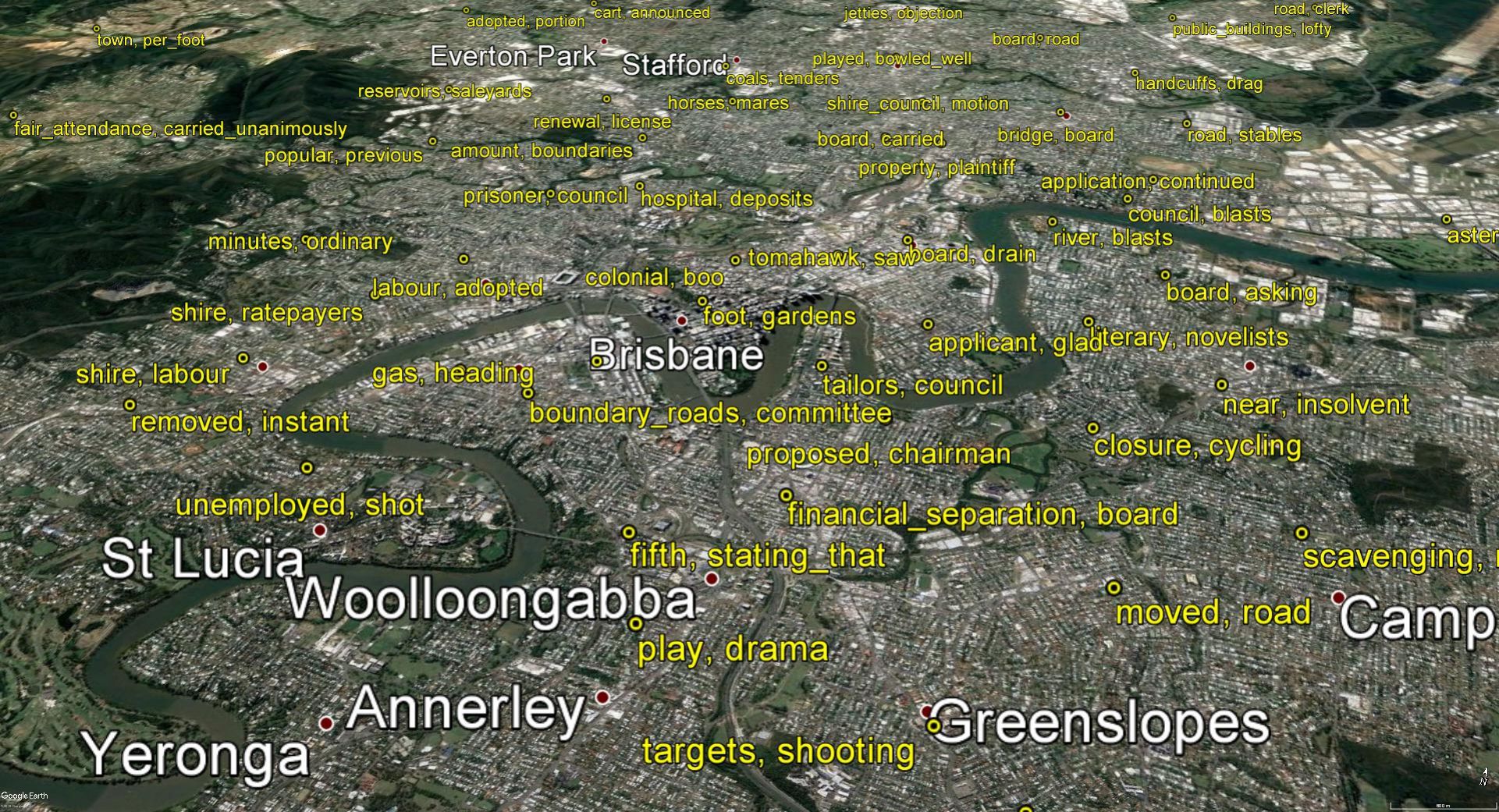
Figure 10. Textual associations of locations in the inner suburbs of Brisbane, aggregated to SA2 regions.
Coverage of these suburbs wasn’t just about meetings and committees, however. News about Ekibin (near Greenslopes), for instance, often mentioned target shooting at the rifle range. Wynnum Road was apparently a popular route for cycling. In Enoggera there were cattle saleyards (as well as the reservoir). And in 1887 in Fortitude Valley, a man was murdered with a tomahawk.
Sadly though, most of the other interesting words in Figure 10 are errors. The drama at Drury Lane, the novelists at Hawthorne, the tailors at Toohey Street, the unemployed at Brisbane Street in St Lucia: all of these (yes, even the unemployed at St Lucia) are the results of geoparsing errors that, hopefully, I will be able to avoid in the next iteration of outputs. As you can imagine, geoparsing streets is especially difficult, as there might be several streets with the same name within a single city, and even in neighbouring suburbs. And having a time gap of more than 130 yeas between the text and the gazetteer doesn’t make things any easier.
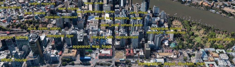
Brisbane’s CBD
Thankfully, the street names in the CBD, most of which were the same in 1885 as they are now, have been geoparsed more successfully. The results, shown in Figure 11, are quite colourful. On Margaret Street, we find both a synagogue and a brothel. Elsewhere in the city, there are reports of people being charged with all kinds of things, from the garden-variety behaving in a drunken and disorderly manner to more pro-level trouble-making such as that of a gentleman named Michael Brennan, who was “turned out of an oyster saloon in Albert-street, after which he wanted to fight the proprietor. The police gave him a very bad character, saying that he had been hanging about Albert-Street day and night for the past six weeks, consorting with women of ill-repute.” (Apparently, oyster saloons were quite common in the 1880s and remained so until the mid 20th century, when fish-and-chip shops took their place.)
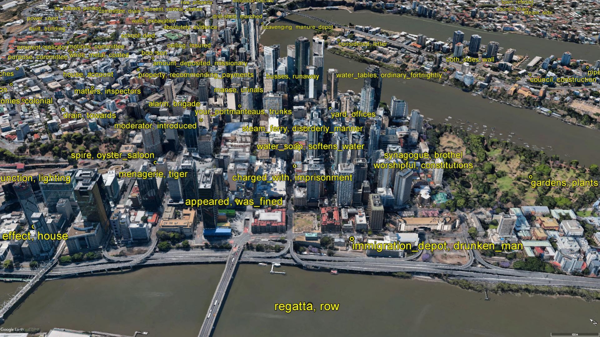
Figure 11. Textual associations of locations in Brisbane’s central business district.
The spire in Albert Street is that of the Albert Street Uniting Church (then the Albert Street Methodist Church), which was completed in 1889, save for the addition of the celebrated 125-foot spire, which was “said to to the the loftiest in the colony”.
Perhaps the most poetic term in Figure 11 is your portmanteaus, which hovers over Queen Street. I only knew of ‘portmanteau’ as a linguistic term, but apparently it can also refer to a large leather carry-bag, the likes of which could have been purchased (alongside ladies’ trunks) from a shop at 53 Queen Street. Although I excluded articles classified by Trove as advertisements, some ads, like the one for the luggage shop, slipped through by piggybacking on the tail end of ordinary articles. The reference to water soap on Charlotte Street also derives from these kinds of advertisements.
So what about the menagerie and the tiger on Turbot Street: surely these words are errors? Amazingly, no. There really was a menagerie in Turbot Street, replete with tigers, bears, cheetahs, monkeys and dingoes. It was run by a Mr Charles Higgins, and it was not very popular with the neighbours. Not only did offensive smells often visit the nearby residents and businesses, but sometimes the animals did as well. On the Thursday of 22 November 1888, one of the Bengal tigers escaped, hospitalising an employee and biting Higgins on the arm. When Higgins’ arm became infected, he ended up in hospital too.
William Madden, the man Higgins left in charge, did little to improve public relations. Residents complained that “On Sunday the growling and fighting of the tigers, mingled with the howling of the dingoes formed a chorus enough to terrify any strong person.” On Monday morning, a dingo escaped and started roaming the streets. On Monday night, the police found Madden lying drunk in Ann Street. The dingo was caught in Alice Street the next morning “by a young man, who said it had played havoc with his poultry.” By this time, a petition from 46 local residents begging for the closure of the menagerie had been made its way to the mayor, who promptly ordered Higgins to move his animals out of the city.
Home at last
I forget sometimes that this blog was supposed to be about Milton and Western Creek. Figure 12 shows the words associated with various locations in this area. As with Figure 10, many of these words derive from council minutes. As such, they paint a fairly coherent picture of what the Ithaca and Toowong shire councils were discussing at this time. If they (or their constituents) weren’t requesting improvements, they were recommending payments; and when they weren’t recommending payments, they were recommending improvements. In other words, things in this part of town had to be improved, and improvements cost money, especially to cover the costs of labour. The things that were most often in need of improvement appear to have been roads and drains, which is unsurprising given that much of Milton was built on swamps and lagoons.
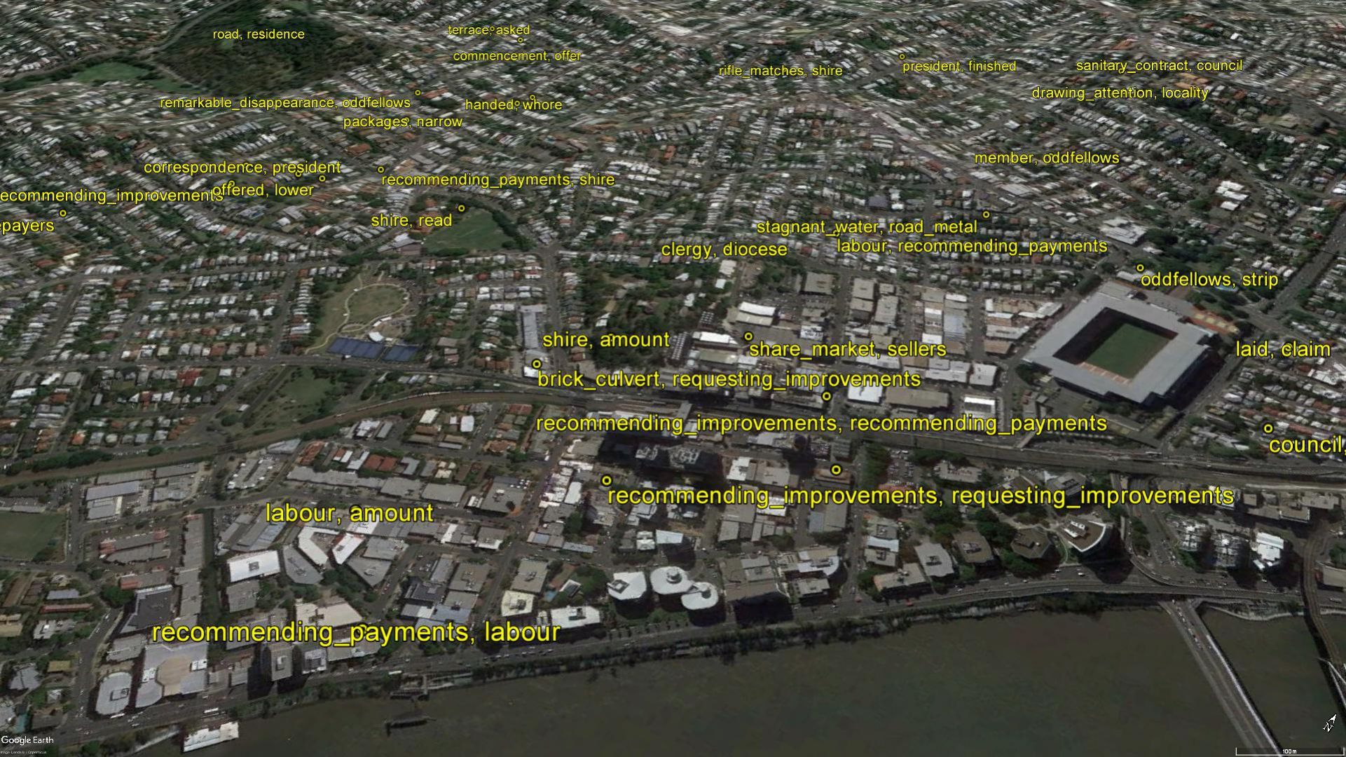
Figure 12. Textual associations of locations in the Milton area, a short distance from the CBD.
But I must confess that Milton is not my home at the moment, and indeed hasn’t been several years now. My venture into Brisbane’s southside has taken me from Rocklea to Coorparoo, and most recently, to Dutton Park. So I feel like this textual survey of Brisbane circa 1885 would not be complete without a quick look at my current neighbourhood.
Figure 13 shows Dutton Park in the middle of the frame. The St Lucia campus of the University of Queensland (my home away from home during the last four years) is in the lower left; Highgate Hill and South Brisbane are in the upper left; Woolloongabba is in the upper right; and Fairfield is in the lower right. The relative sparsity of words in Dutton Park and Fairfield suggest that these areas were not heavily populated in the late 1880s — at least not by the living. One thing that did exist in Dutton Park back then was the South Brisbane Cemetery.
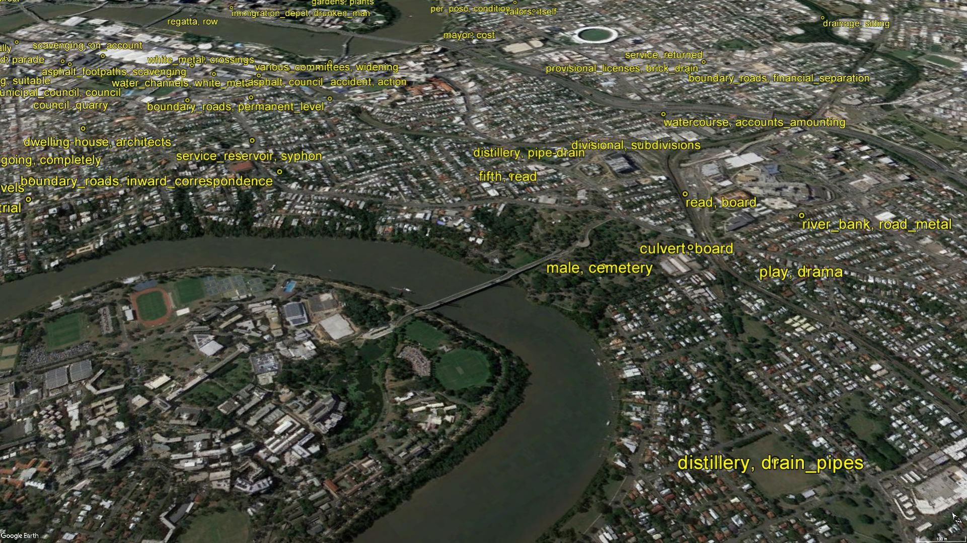
Figure 13. Textual associations in the region surrounding Dutton Park, an inner suburb of Brisbane.
Much more interesting than the cemetery in Dutton Park is the reference to a distillery in Fairfield. The distillery in question was owned by a Mr Pullé, who also owned a coffee palace in the Grand Arcade at the corner of Elizabeth and Albert Streets. (By owning both a coffee palace and a distillery, Mr Pullé was having a bet both ways, since coffee palaces were championed by the temperance movement in the 1880s as an alternative to pubs, and coffee as the antidote to alcohol.) Sometime in 1886, Pullé entered into a partnership with a grape grower from the Roma district named Mr Calcino to produce wine from his surplus grapes. (Evidently, Mr Calcino’s Mount Abundance Vineyard had lived up to its name.) The two men built a winemaking facility on a plot of land near Fairfiled Railway Station, to which the grapes could be conveyed by rail all the way from Roma. Unfortunately, this particular load of grapes had already began to spoil, and the resulting wine — all 6,000 gallons of it — was not fit to drink. So Mr Pullé, drawing on his skills acquired in the Italian booze business, decided to turn it into brandy.
Mr Pullé applied for a distilling license in October 1887, but he had to wait for a special act of parliament to be passed before he could commence operations. His brandy still, being of a different construction from those used to make rum from molasses, produced more spirit than was permitted by the Licensing Act. By February 1888, he had his permit and was producing brandy (“pleasant but strong”, according to a reporter who tried some) as well as wine, the first batch of which came from grapes grown at Sandgate. He also tried making casks out of local ironbark and yellowood, but this experiment did not prove to be very successful.
The Fairfield distillery kept producing until it was hit by the flood in February 1893. The whole plant was up for sale on 1 March 1893, and it was still on the market in May 1894. Its closure was unlikely to have been mourned by the neighbours, sparse as they may have been. In 1889, the smell from the distillery was such that the Stephens Divisional Board (the local government of the area between South Brisbane and Rocklea) agreed to loan the necessary funds to build iron drain pipes to convey its waste to the river. In 1892, the nuisance returned when the pipes became blocked, prompting further action from the board.
Today, Fairfield is almost entirely residential, but you only have to travel two more stops on the train before you encounter the mixture of residential and light industrial zoning that is the suburb of Yeerongpilly. And while there is no distillery there, there are two microbreweries that (unlike Mr Pullé’s distillery) have proven to be very welcome additions to the neighbourhood.
Final thoughts
So, there you have it: geographic text analytics. Or should that be geodiscursive text aromatics? Whatever it is, it seems to work. Sure, there are errors in the results shown here, but these can be ironed out. Wherever the geoparsing has been successful, the words that this method has dredged up are nearly always meaningful, and in some cases they’re downright fascinating. Uncovering nuggets like Mr Higgins’ menagerie at Turbot Street and Mr Pullé’s distillery at Fairfield was exactly what I hoped this method would do. And even when the results aren’t so surprising, they paint an accurate portrait of both regional industries and local concerns. Sugar in the north, gold in the south, and cows (and rabbits) in the middle: this seems like a pretty good summary of eastern Australia in the late 19th century (indeed, other than the gold mining, it more or less holds today). In Brisbane itself, the method revealed a growing town grappling with nuisances caused by public drunkards, poor drainage and conflicting land uses, while also dealing with long-term planning issues such as the water supply.
The point of this exercise has not been to answer a specific research question or solve some longstanding problem, but rather to add value to an already valuable resource — namely, the collection of newspapers on Trove. The value that I’ve sought to add is a layer of curation designed to encourage exploration and facilitate discovery. If you’re already familiar with the history of Australia, or a particular part of it, then this method will undoubtedly tell you much that you already know; but there is a good chance that it will also dig up some surprises. On the other hand, if you’re a bit foggy on the history of your region or neighbourhood, then this method offers an efficient, engaging, and — I’m just going to say it — fun way to learn about it.
As a means of mapping culture and history, this method overcomes the inflexibility that comes with relying on etymology, and the subjectivity that comes with maps based on stereotypes and humour. But the outputs demonstrated here are still limited in that they capture only one of many different accounts of the landscape that could no doubt be extracted from the Brisbane Courier in the last half of the 1880s. This is a feature of the method, not a bug. This is, after all, what curation does. You can’t emphasise one narrative without obscuring or downplaying another.
The beauty of this method, however, is that it can be tweaked to produce different narratives, even from the same collection of texts. As I noted earlier, there is more than one way in which words can be crunched statistically to produce meaningful pairings. For example, I’ve included calculations that make the top words for a given place less like those of other places of the same type (I didn’t want to the top word for every river and stream to be ‘water’, for instance). This calculation could be switched or supplemented with one that instead considers the rarity of words across the whole dataset (regardless of feature type), thus yielding a different, but no less correct, set of pairings. The trick lies in matching the calculations to the goals and interests of the user. Ideally, the user would be able to switch dynamically between different pairing schemes, giving equal voice to the various narratives that each one produces.
Where to from here? Hopefully, to other periods recorded by the Brisbane Courier. Possibly, to other newspapers, or to other text sources altogether. At the very least, I hope to refine the underlying method so that it performs more accurately and efficiently in future applications. If I think it’s worth publishing and sharing, then I will do that too. How soon any of this happens will depend on how my post-PhD life shapes up. While I no longer have a thesis to write, I do have to attend to the small matter of finding a job. If you happen to be hiring in geodiscursive text aromatics, then do get in touch.
Try this at home!
The examples above cover only a small sample of the results from these five years of the Brisbane Courier. If you want to explore the remainder, the best way to do it is to download this KMZ file and open it in Google Earth. (If you don’t have Google Earth installed, you will need to download and install it first. There is also a browser-based version of Google Earth, but it won’t let you load this KMZ file.)
If you’re using a super high-resolution display, the pop-up balloons in Google Earth might appear too small. In that case, use this version of the KMZ file instead. If it still doesn’t look right, you’ll have to fiddle with the font and label sizes from within Google Earth.
If you can’t install Google Earth, you can also explore the outputs (unaggregated version only) below through on Google Maps. But be warned, the experience is vastly inferior to what you will get on Google Earth. And the functionality (especially the pop-up information for each place) might be limited on mobile devices.
If you make any great discoveries using these outputs, feel free to share them in the comments below. As for the errors — of which you will find many — there’s no need to share them unless they are particularly surprising or amusing. With any luck, many of these errors will disappear as I refine the geoparsing process.
Pingback: KnewsGetter: a Knime workflow for downloading newspaper texts from Trove | Seen Another Way
Pingback: TroveKleaner: a Knime workflow for correcting OCR errors | Seen Another Way
Pingback: TextKleaner – a Knime workflow for preparing large text datasets for analysis | Seen Another Way